
Artists’ Pigments: A History of Ultramarine Blue
Explore the history of Ultramarine Blue, from its origins as a rare & expensive pigment to its status as one of the most popular blues for artists.
With a wonderful mid blue hue and great mixing capabilities, it’s not hard to see why Ultramarine is a hit with artists all over the globe. Today it’s an essential colour for many, but it hasn’t always been so easily accessible. More precious than gold, Genuine Ultramarine was once the preserve of only the richest patrons. Discover more about the history of this popular colour and how modern chemistry helped Ultramarine to find its way onto the palettes of artists’ today.
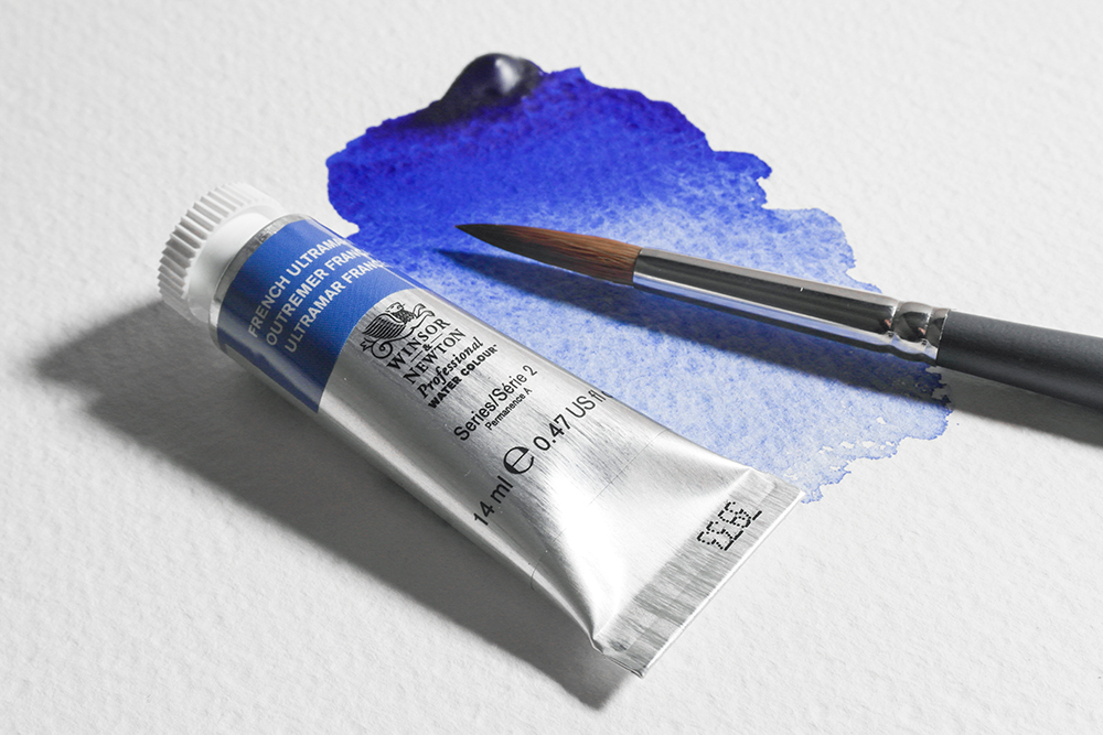
For many artists, Ultramarine is their first choice of blue – regardless of the medium they work in. It’s a versatile blue, offering brilliant colour in it’s own right but showing even more diversity in mixes. The name Ultramarine finds its roots in the Latin ‘ultra’ (meaning beyond) and mare (meaning sea). This etymology hints at the origins of a colour sourced beyond the sea and gives us a glimpse into the journey that Ultramarine once took to reach our palettes. There’s no doubt that it was a colour worth going the extra mile for.
The History of Genuine Ultramarine and Lapis Lazuli
The origins of Ultramarine begin deep in the ground, with the semi-precious mineral Lapis Lazuli. The main component of Lapis is Lazurite, a mineral that gives it it’s destinctive blue colour. Before the 1800s this stone was the source of Ultramarine pigment.
Lapis Lazuli has long been prized for its rich colour. In fact, prior to its use as a pigment, it adorned decorative objects, sculptures and jewellery. The earliest examples of Lapis pigment are in cave paintings in Bamiyan, Afghanistan dating back to the 6th and 7th Centuries AD. It is in Afghanistan that the journey of Ultramarine paint begins.
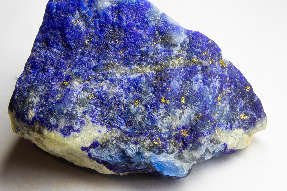
Donkeys and Camels once carried nuggets of Afghan Lapis along the Silk Road – then the world’s busiest and most influential trade route. From Syria, the stones made their way by ship to Venice. Artists from all over Europe knew that they could source the finest Ultramarine from Venice. So from there its popularity spread through the continent.
Making Ultramarine Paint from Lapis Lazuli
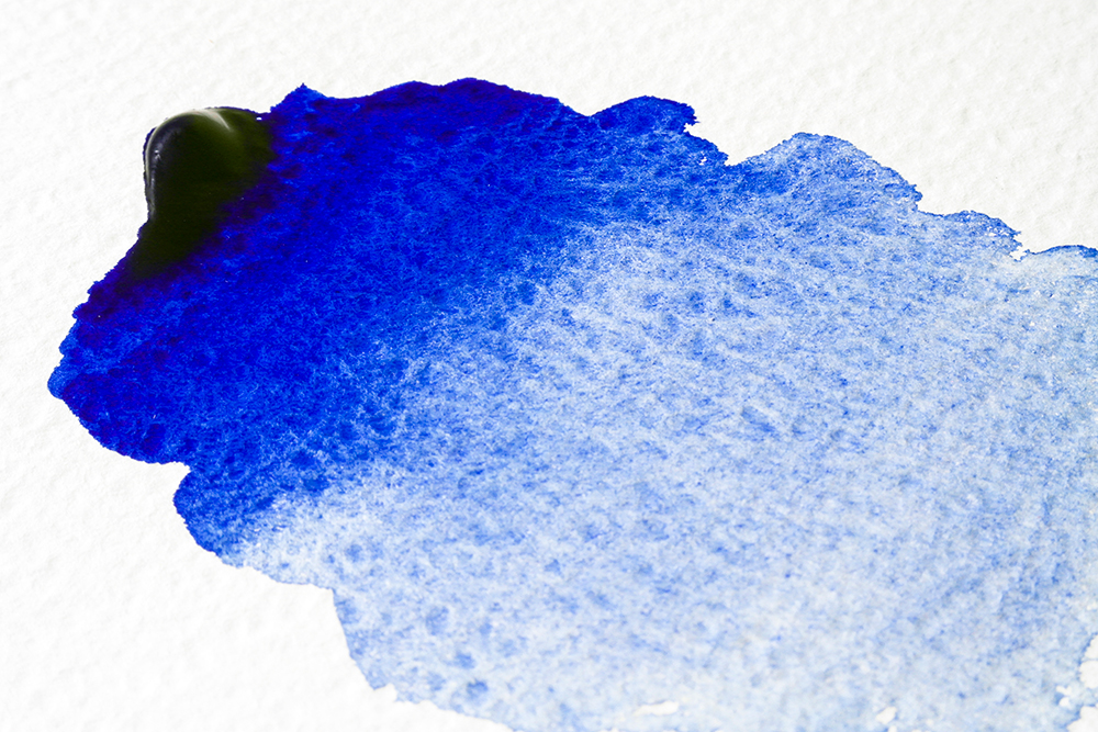
Creating Ultramarine pigment from Lapis was time consuming and expensive. Lapis is full of impurities – it’s a difficult job extracting pure lazurite from these, and any residual impurities would give a disappointingly greyish pigment. The ground mineral is first bound in resins, oils and waxes before being heated to form a dough. This dough was kneaded then placed in a lye solution. In this solution, blue flakes would separate, sink and dry – creating a fine blue powder. Workers would repeat this process multiple times, with each successive kneading drawing out any remaining colour. The final knead would extract a greyish, pallid pigment known as ‘Ultramarine Ashes’.
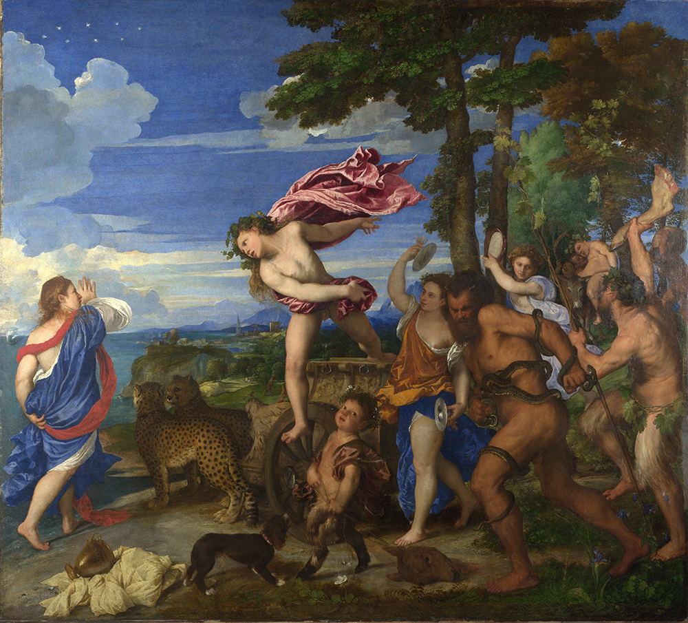
Ultramarine was once more expensive than gold due to its lengthy and complex production process and sourcing of raw materials. It’s high price was reflected in its use – artists painted with it sparingly. From the 1400s it was common to see it as a glaze in religious paintings – especially over the robes of Virgin Mary to enhance their colour and symbolise her divinity. Not only was the colour a nod to purity and divinity, it also became a status symbol for those patrons wealthy enough to commission its use. Sometimes patrons would buy the pigment themselves, releasing it to the commissioned artist only as needed. Artists would also invoice trips to Venice separately on commissions, allowing them to source the pigment. One of the most notable works of art that use genuine Ultramarine is Titian’s ‘Bacchus and Ariadne’.
French Ultramarine – A Modern Synthetic Alternative
The Royal College of Art initiated the search for a synthetic Ultramarine and offered a prize for the first formulation. A higher prize was issued by the French Government and was won in 1826 by French Chemist Jean-Baptiste Guimet – hence ‘French’ Ultramarine. His formula included clay, soda, charcoal, quartz, and sulphur and yielded a colour with the same chemical structure and intensity as genuine Ultramarine. With the introduction of a new, more affordable Ultramarine, genuine Lapis paint fell in popularity. By the 1870s French Ultramarine was the standard Ultramarine Pigment.
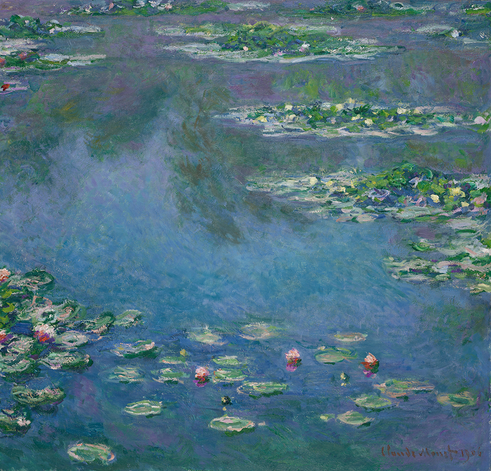
In the piece below, Claude Monet used mixes of French Ultramarine and Cobalt Blue along with other colours in his palette to create a wide range of blue-toned shades.
Some manufacturers still produce genuine Lapis Lazuli paint, with most sourcing the mineral from mines in Chile and China.
Working with French Ultramarine
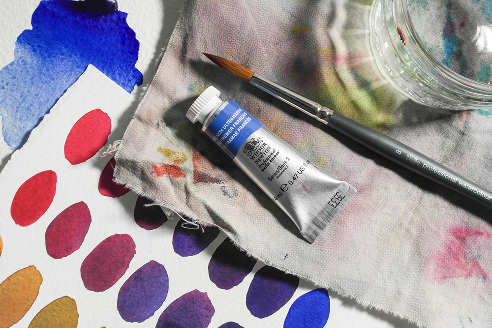
French Ultramarine is a mid blue made from a single pigment – PB29. Different Ultramarines are available from different brands, so you may come across Ultramarine Green Shade, Ultramarine Light, Deep and more. However they all use the same pigment. It typically has a warm, reddish hue, although anything described as ‘Green Shade’ will have a cooler tone. Although they’re all made with the same pigment, the particle size of the pigment does a lot to determine the warmth and coolness of the colour. Larger particles will translate to a warmer blue, while smaller particles impart a cooler tone.
French Ultramarine has a popularity that spans mediums, with many artists choosing it as the primary blue on their palette. In watercolour it has granulating properties and works brilliantly as a mixing colour. It’s a great colour for using in limited palettes, especially if you’re working with a primary triad. Here we’ve used it to create a basic colour wheel with Opera Rose and Winsor Lemon.
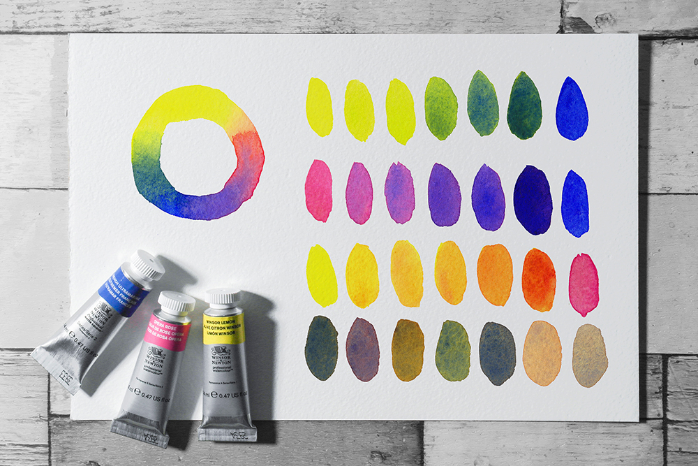
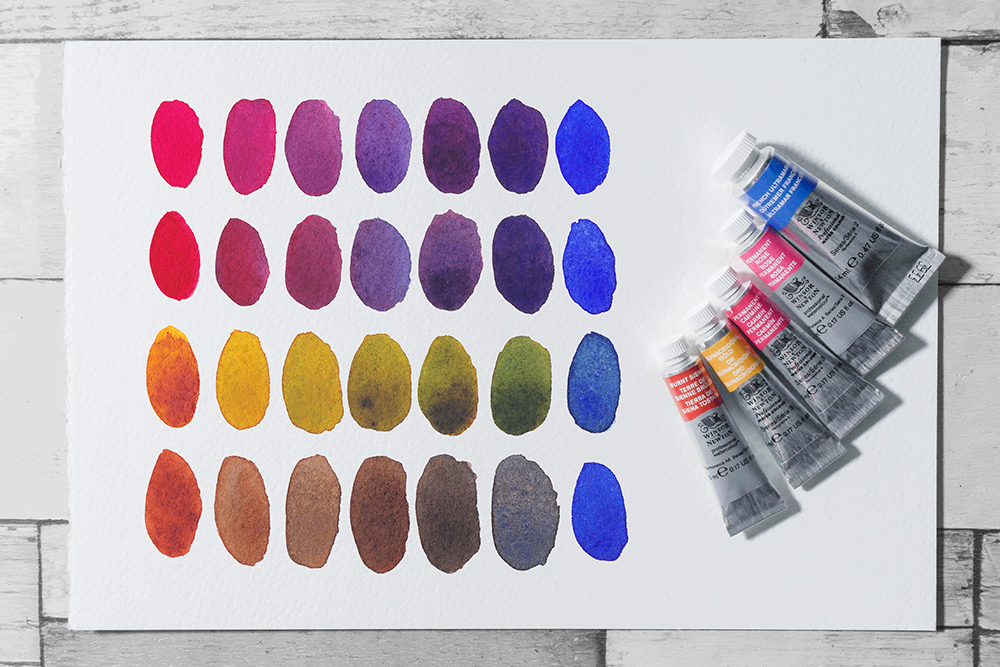
Try mixing it with Permanent Rose or Permanent Carmine to create radiant purples. Using a warm yellow like Quinacridone Gold will yield some natural, earthy olives, while a bright clean yellow (like Winsor Lemon) can create more vibrant greens. It also makes some fantastic neutrals if you mix it with Burnt Sienna or an earthy orange.
The most popular blue on our palettes
The history of Ultramarine is a story of true passion for colour, and the extremes that humans will go to in order to obtain it. It also highlights the wonders of modern chemistry. It’s indisputable that the introduction of French Ultramarine liberated many creatives, and opened up a wonderful colour to artists of all budgets. It is now undoubtedly a valuable and essential colour for many, offering unique working properties and a rich, luminous hue.