
124th Annual Exhibition of the Pastel Society
I visited the 124th Annual Exhibition of The Pastel Society on Wednesday. The theme of this year’s Pastel Society Exhibition is ‘Pastel Without Boundaries’.
This post covers:
- general observations about the exhibition – compared to the previous 17 previous annual exhibitions – all of which I have seen and commented on (except for last year when I was immobile post surgery)
- artwork I liked
- things which IMO need to change and/or improve
Some exhibition metrics will follow after the end of the exhibition.
This post is later than I intended as I ran into major problems yesterday with Blogger absolutely refusing to upload images. So I waited 24 hours and it’s now back to normal. However this left me more time to mull over over my thoughts on the show.
 |
| Pastel Society Annual Exhibition 2023: Catalogue Cover |
You can see my photos of the exhibition on my Facebook Page
Observations about the Exhibition
All that follows needs to be viewed from the perspective that I am a very big fan of dry media and pastels – so some of the comments made below are hard to make – but I think need making. This is far from the best annual exhibition by the Pastel Society that I’ve seen. I’d very much like to see a much better exhibition next year.
Which is not to say it doesn’t have some very good artists and some very good artwork in the show – but rather that they seemed somewhat submerged.
It does however feel to me that the underlying project management of the total show has not been good.
The Theme: Pastels without boundaries
If you have a theme for a Show then I expect that to be reflected in the content and in the hang. I went back and looked at what it said in the Call for Entries as I couldn’t see any obvious reference to “Pastels without boundaries”
I still don’t get it.This year’s theme is Pastel without Boundaries. To quote the Society’s President, Richard Rees: “Drawing and painting can provide a time to reflect and lose ourselves in a creative process. As one of the great exponents of pastel, Paula Rego, once said, ‘Art is the only place you can do what you like. That’s freedom.’ Pastel and similar dry media are the most direct way we can express our thoughts and whether on their own or in combination with other media, it has infinite possibilities.”
There was one section labelled – in a small font size – Pastels without boundaries – but I couldn’t see much difference between the artwork here and anywhere else.
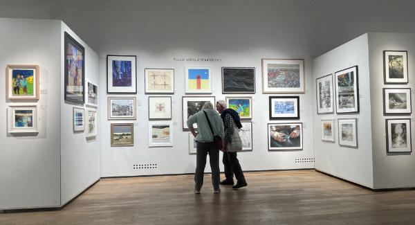 |
| Can you read the “Pastels without boundaries” strapline? I didn’t know whether this was meant to represent examples of “Pastels without boundaries” |
The Hang
diverse artists with diverse styles and diverse colours and diverse subject matter are all hung together – which confuses the eye (my main note about the exhibition)
It wasn’t so much that I disliked the hang so much as I just found quite a lot of it boring and/or the visuals jarring.
So I sat down with a cup of tea and an extremely hard chocolate cookie (Not nice! it didn’t help matters!) and tried to work out why I felt quite so underwhelmed by the exhibition.
You can find these notes below.
I also used my other perennial test of any exhibition. I try to remember all the artworks in the show the next day from memory.
- With really good shows that are well designed and have good artwork which is well hung, I almost always have a very good visual memory of the whole show and what was where. I have a very good visuo-spatial memory and can recall sometimes those memories weeks, months and sometimes years later.
- With this exhibition, I found I had difficulty remembering what any of the artwork was on some of the walls the next day – with the exception of some.
Here are some of the notes I made while first impressions were still fresh
- A somewhat flat – and sometimes depressing – exhibition compared to the previous PS exhibitions I’ve visited and reviewed (I go back to 2006 – you can find a list at the end and you can also see the photos I took of those exhibitions in my reviews!)
- Fewer large works and more medium / smaller works (e.g. no large works by Mathew Draper) Maybe not surprising given the current market (I watched the same thing happen in many exhibitions at these galleries in 2008 and 2009) This makes it harder to create focus and rhythm in the hang on the walls.
- It lacks “wowzer” (meaning “come and look at me – right now!“) artworks anchoring some of the main walls.
- Lacking colour: Looking back at my photos, there seems to be an awful lot of greyish / muted / monochromish artworks.
- Somebody influential on the panel seems to like very dark / greyish works.
- Or did nobody submit works with lots of colour? The one thing I know is there’s a lot of people who like colourful artwork.
- I like monochrome and simple palettes – however there is a limit to how much muted work I can view.
- See the catalogue cover above and the Pastel Society Catalogue Award winner below plus some of the views of the exhibition
 |
| End wall in the East Gallery – little spots of color and a lot of muted / monochromish |
 |
| Pastel Society Catalogue Award: First Prize – I found it very dark and somewhat dismal |
- The West and East Galleries look visually cluttered due to tables and chairs everywhere! (excluding the cafe end which seemed more tightly packed than normal!) It reminded me of how parochial exhibitions can sometimes look rather than professional / commercial exhibitions where the whole “look” of the exhibition is carefully designed. (As had happened the previous week with the SBA Exhibition).
- Some of the artworks appeared to be hung without any obvious rationale – although this was not the case for all walls. Artworks looked much better when:
- similar themes eg landscapes are hung together
- four artworks on similar subject matter by the same artist are hung together
- Most of the open artwork seemed to be relegated to the North Gallery.
- I really thought we’d got past this notion of members in the West and East and everybody else in the North.
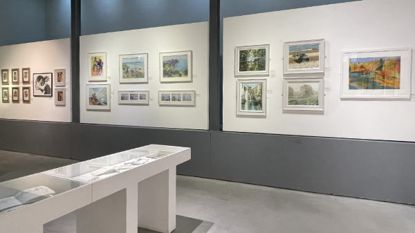
- Interestingly some of the best and most interesting new work can be found in the North Gallery – and I definitely recommend people take a look at it!
 |
| View of part of the North Galleries |
By way of comparison,
- I’d been in the Gallery a week ago to see the Society of Botanical Artists’ Exhibition – where there was a very clear strategy about how the hang worked. They had walls on different themes. It worked extremely well.
- I’ve seen many exhibitions by FBA Societies where they have a very strong monochrome wall – where all the monochrome artwork looks better because it’s not competing next to colour.
I also noted that red spots were sparse. There were much fewer sales than I’d normally expect at this stage of an exhibition. Most of the other FBA exhibitions seem to have become fairly successful at generating sales beforehand via marketing the online exhibition and then following through with invites to previous buyers to attend the Private View – or even a Buyers Preview. I had also noted that social media marketing prior to the exhibition was also low key to almost non-existent compared to the efforts made by some of the other art societies.
The Visual Intrusions
For me, an exhibition should look like a well designed shop window of a store. Your eye needs to be drawn in and around what is on offer – until you can’t wait to get inside the store or to walk over to see what looks intriguing. Or in this case down the stairs and into and across the galleries
HOWEVER, I’ve rarely seen an exhibition in the last 17 years of visiting exhibitions at the Mall Galleries where I was so aware of visual clutter in both the main (East and West) Galleries. I am emphatically NOT a fan.
The visual impact of the West Gallery
Normally I expect and usually see impressive artwork anchoring the west wall – to draw me across the long expanse of the West Gallery. Once in the middle of the Gallery, I also very often notice how the long walls on either side have been anchored by strong and/or colourful artwork in the middle of the wall.
Instead I was distracted by the visual clutter of two tables at the end of the Gallery. It wasn’t clear what either was about or why they needed to be there – obscuring the art.
- I subsequently learned one was for sales – which seemed very odd as sales have always taken place at the front desk and besides nobody was sitting there for most of the time I was visiting
- The other was about Portfolio review – but this was not obvious and again – no takers.
Why on earth the space on the Mezzanine (where the shop used to be) wasn’t used I do not know. Then both tables and their purpose could be made obvious to everybody as they came into the Gallery – and without complicating access or obscuring the view of the art for everybody else.
It felt like nobody had ever watched how people usually move through this particular space at the end of a very large gallery. Or appreciated that this wall should act as a big PULL to people moving through the gallery! Maybe because most of the artwork on the wall lacked colour – which is very often the other feature of artwork on this wall which generates the PULL!
 |
| More monochrome than colour on the end wall – but the tables and chairs are visually intrusive |
The Studio in the East Gallery
Frankly, the area in the East Gallery given over to increasing awareness of the use of pastels just seemed to sprawl all over the central floorspace and really interfered with the navigation of the gallery.
- It completely killed any aesthetic views of the exhibition.
- Actually trying to standback from a wall to take in what was there was actually quite difficult because of all the display stands and tables and chairs which were in the way. It was as if a really messy studio had been imported into the middle of an exhibition. IT DID NOT IMPRESS – quite the reverse. Moreover it was unmanned for quite a lot of the time…..
- There are other places within the Mall Galleries where this very useful activity can be more usefully installed.
 |
| A view of the East Gallery which I don’t often take – but the only view where there were no tables and stacked chairs |
Artwork I liked
I pick artwork I like as I go round – but don’t look up the artist until I get home and start writing this blog. Which always makes it exciting to see if other artwork stacks up with what is exhibited in the exhibition!!
I really liked two groups of artworks by new exhibitors in the first gallery on the right in the North Galleries. This had been mainly given over to mostly monochrome or dark artworks and looked very good. In my experience monochromes look better when hung together.


More work from open first time (?) exhibitors in the North Gallery below.
 |
| Pastel drawings of Dartmoor by Jayne Perkins |
 |
| Thought Lines by Kaija Bulbrook (Pastel) |
What needs to improve
I’ve not had to write a list like this in a very long time.
Standards have slipped
- The hang of the exhibition. See comments above
- The areas designated for the studio, sales and portfolio reviews. See comments above
“Somebody” needs to get a much better grip on visual communication with prospective and actual visitors to the exhibition.
- The catalogue needs to be 100% accurate. I started to do my count of the numbers re members and open entry and sales – and very quickly realised that the listing at the back of the catalogue is inaccurate (i.e. longstanding member Tony Allain is completely missing from the first page!!)
- Announcement of activities during the exhibition is invisible in the Gallery. There’s some very basic shop window activities which need MUCH more attention paid to them. Like why wasn’t there a very visible “look at me” listing of ALL activities during the show in a suitable font size at the entrance. I came across a listing on paper on a bench in the studio area – a very long detailed list in a font size which was far too small.
- Marketing on Facebook – I couldn’t share anything posted by The Pastel Society about the exhibition on Facebook – because there was nothing to share.
- Nothing about the dates.
- Nothing about the activities.
- Most of the art societies I cover on this blog learned a long time ago about the vital need to start driving interest and visitors to via ALL social media prior to the exhibition in a managed and controlled way.
Those submitting via the open entry also need some feedback about their chances of getting selected. It’s an important consideration when people are spending money on entry fees in the current context. If I was a society trying to attract submissions via the open entry (and associated fees), I’d be providing some feedback to those who enter as to the level of competition: eg
- how many artists entered via the open entry this year
- how many artworks entered via the open entry this year
- how many were selected
However there is no mention of numbers in the catalogue – where art societies normally boast about how many people submitted work this year. Which makes me wonder about that too…..
More posts about Pastel Society Exhibitions (2006-2022)
You can review my previous posts about Pastel Society exhibitions during the last 17 years – from my archives.
This was this year’s Call for Entries post


